
Coloring Guide
How to Blend Colored Pencils on Coloring Pages
Learn a simple colored-pencil blending method for coloring pages using light layers, gradual overlap, and a little practice on broad floral shapes.
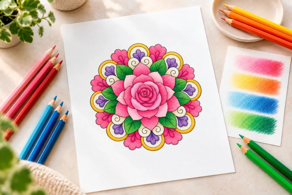
Blending with colored pencils does not need to begin with a special tool or a complicated technique. On a coloring page, the most useful place to start is simple: use light layers, let two colors meet gradually, and give yourself enough room to adjust before pressing harder.
The aim is not to erase every pencil mark. A little pencil texture can make a page feel warm and handmade. Blending simply helps two nearby colors move into one another more gently, so a petal, leaf, ring, or background section does not stop abruptly at a hard line.
What blending means on a coloring page
Blending is the gradual transition from one colored-pencil shade to another. Instead of filling one half of a shape with one color and the other half with a second color, you build both colors in light passes and allow them to overlap in the middle.
That overlap is the important part. It creates a transition zone where neither color ends suddenly. The more gently you layer there, the smoother the change can look.
You do not need to make every area of a coloring page blended. The technique is most helpful where a shape has enough open space to show a change in color, such as a broad flower petal, a large leaf, a curved band, or a simple repeating ring.
Begin with two colors that are easy to connect
For a first practice session, choose two colors that already feel related. A light pink and a deeper coral, pale green and darker green, or light blue and navy are easier to blend than two very different colors.
Using related shades lets you concentrate on pressure and layering instead of trying to solve a difficult contrast at the same time. Once the movement feels familiar, you can try more noticeable transitions.
Choose a light color and a darker partner
A useful starting pair has one lighter shade and one darker shade from the same general color family. The lighter pencil gives you a soft base, while the darker pencil creates depth at an edge, near the center of a flower, or wherever you want the shape to feel more dimensional.
Set both pencils beside the page before beginning. If you have a scrap of paper, make a quick swatch of each color and a small overlap between them. This is enough to show whether the pair feels comfortable together.
Build the first layer lightly
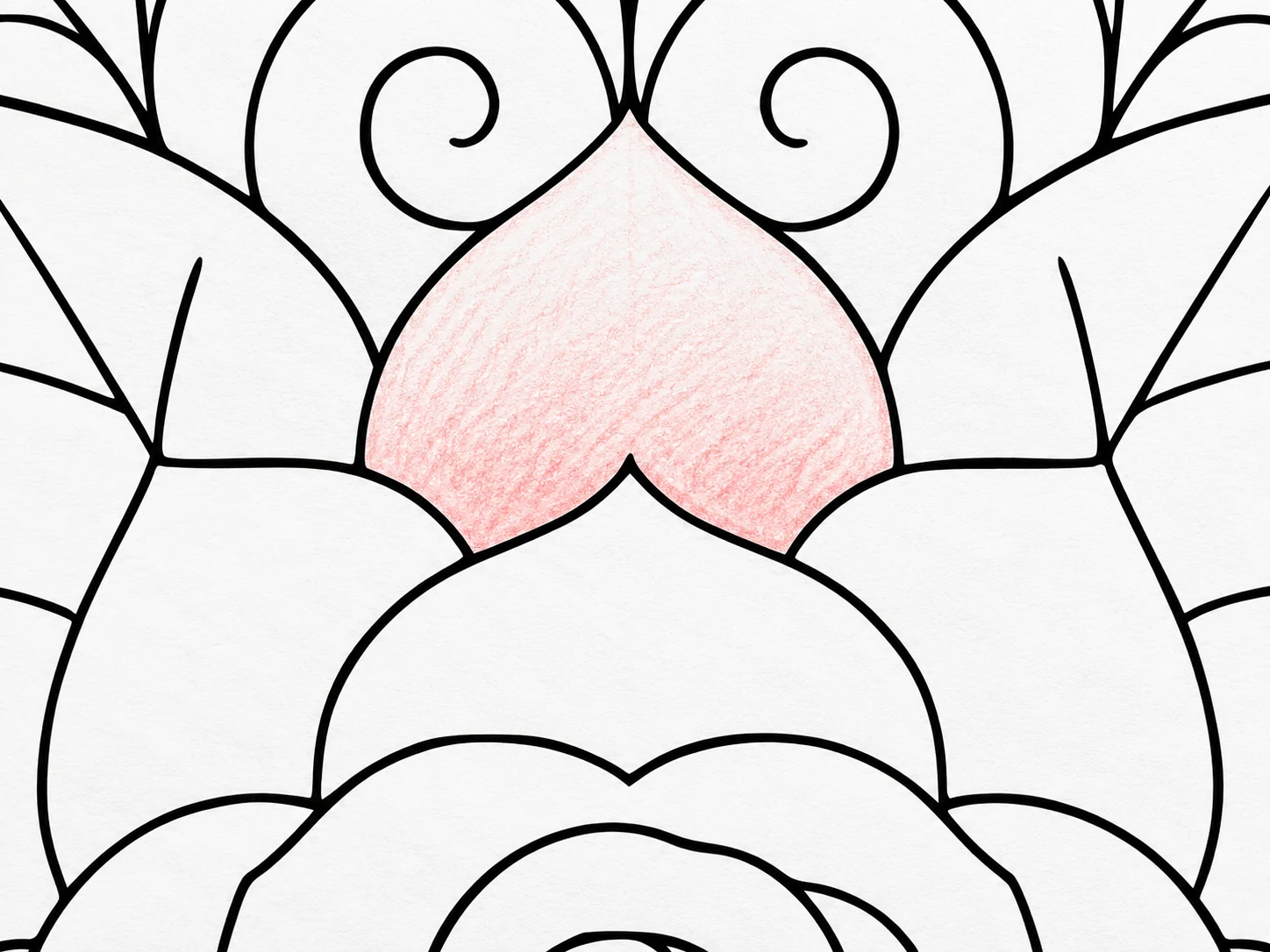
Start with the lighter color. Use gentle pressure and cover the full area where you want the transition to appear. Think of this first layer as a guide rather than a finished surface. The paper should still have room to receive more color.
Move the pencil in small, overlapping circles or soft short strokes that follow the shape. On a petal, let the movement travel from the center toward the outer edge. On a curved ring, let it follow the curve. This helps the color feel connected to the drawing instead of sitting in separate straight bands.
Do not worry if the first layer looks pale. A pale beginning is useful because it leaves room to add the darker color gradually.
Overlap the second color gradually
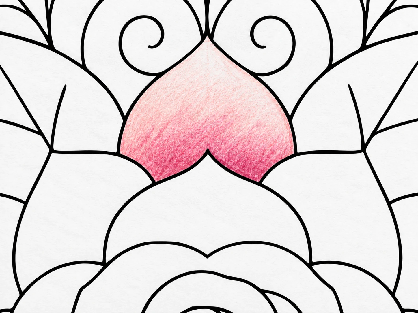
Now bring in the darker color. Begin where you want the deepest value, but keep the pressure gentle at first. Instead of coloring up to a sharp stopping point, let the darker color extend gradually into part of the lighter area.
Go back to the lighter pencil and work softly over the place where the two colors meet. Then return to the darker pencil if the transition still feels abrupt. Alternating the two colors in this small zone helps soften the boundary.
Work from the darker area toward the lighter area
When you add another layer, start in the darkest part of the shape and move toward the lighter area with gradually less pressure. This helps the stronger color fade instead of ending suddenly.
If the darker color travels farther than you intended, return with the lighter pencil and work gently back across the overlap. You are not trying to cover the darker color completely; you are helping the two layers meet more gradually.
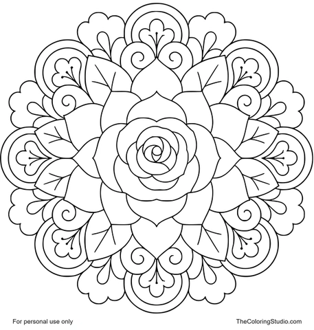
Practice on the Rose Blossom Floral Mandala
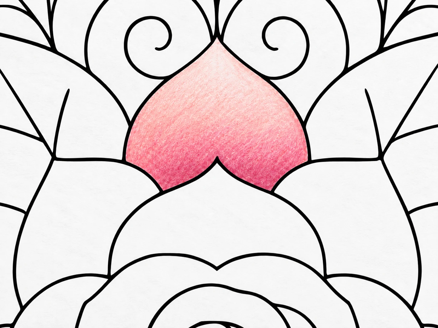
The Rose Blossom Floral Mandala is a useful page for practicing this method because its broad layered petals give you enough open space to see a gradual transition clearly. Choose one petal and treat it as a small experiment before deciding how to color the rest of the design.
Begin with a light pink or coral layer across the petal using gentle pressure. Add a deeper pink near the base, then let the darker color move gradually into the lighter area instead of stopping at a hard edge. Return with the lighter pencil and work softly over the overlap until the transition feels more connected.
Once the first petal feels comfortable, repeat the same method on another similar petal. You can keep the same colors, change the size of the darker area, or use slightly lighter pressure to compare the results. The repeated floral structure makes it easy to practice the same technique more than once without changing designs.
Use repetition to make the technique easier
A mandala is especially helpful for practice because similar shapes appear more than once. After blending one petal, try the same transition on a second petal. You can repeat the same method, make the darker area a little smaller, or test a lighter touch.
Repeating one shape teaches more than moving immediately to a different page. You can see which version feels smoother, which pressure gave you the best result, and how the colors look when the same transition appears around the design.
The Floral Mandalas collection offers more pages with petals, leaves, rings, and radial sections that work well for this kind of gentle repetition.
Common blending mistakes and simple fixes
Pressing hard too early
Heavy pressure in the first layer can make the color look strong quickly, but it leaves less room to build a gradual transition. If you notice this happening, do not try to force more color over the same spot. Move to the next petal or section and begin again with a lighter hand.
For future areas, make the first pass much softer than you think you need. You can always add more color later. It is much harder to make a dark first layer feel lighter afterward.
Leaving a sharp line between two colors
A hard line usually means the colors met only once. Return to the meeting point with the lighter pencil and make a few soft passes over the edge. Then use the darker pencil lightly in the same area. Small alternating layers are more effective than one strong attempt to hide the line.
Trying to fix everything at the end
Blending works best while the area is still developing. Check the transition after each light layer instead of filling the entire shape first and trying to repair it later. When the colors are still light, it is easier to adjust where the darker shade begins and ends.
Add basic shading only after the transition feels comfortable
Blending and shading can work together, but they are not the same task. Blending softens the movement between colors. Basic shading gives you a reason for one part of the shape to be darker than another.
For a simple flower petal, keep the deepest color near the center and let it fade toward the outer edge. For a leaf, keep a little more dark green close to the base or beside the center vein. You do not need to add dark color everywhere. A small amount is enough to make the transition visible.
If you are still learning, focus on one change at a time: first create a gentle transition, then decide whether the area needs more depth. This keeps the process clear and prevents the page from feeling overworked.
A five-step blending routine for your next page
- Choose two related colors. Start with a light shade and a darker partner from the same color family.
- Make a small swatch. Test each color and a short overlap on scrap paper before using the page.
- Lay down the lighter color first. Cover the full area with gentle pressure.
- Add the darker color gradually. Begin where you want the deepest value and move it gently into the lighter area.
- Return to the light color. Soften the meeting area with another light pass, then stop and look before adding more.
Use this routine on one broad shape before attempting an entire design. When that first petal, leaf, or ring feels right, repeat the method on the next similar shape. Blending becomes much easier when you allow it to develop through small layers instead of expecting one perfect pass.
Put the guide into practice
Try These Coloring Pages
Keep exploring
Explore Related Collections
From learning to coloring
Ready to Color?
Explore free printable coloring pages for your next creative moment.
Browse All Coloring Pages