
Coloring Guide
How to Choose Colors for Coloring Pages
Learn a simple way to choose colors for coloring pages: build a small palette, test it first, give each color a role, and use a colored reference as inspiration without feeling tied to it.
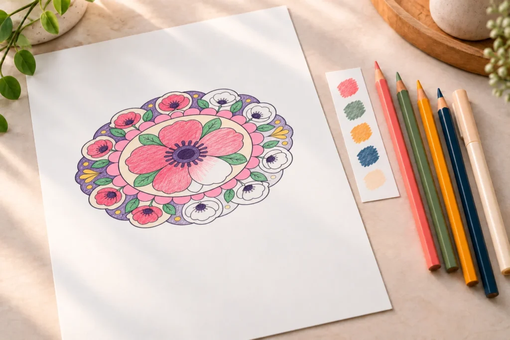
Choosing colors can feel harder than coloring itself. When every pencil, crayon, or marker is available at once, it is easy to keep comparing possibilities until the page stops feeling relaxing. A simple plan gives you a place to begin without taking away your freedom to experiment.
You do not need to know advanced color theory or find the perfect combination before you start. Choose a small palette, test it in a few quick swatches, decide where the colors will appear, and let the page develop from there. The goal is not to make every choice permanent. It is to make the next choice easy enough to begin.
Start with a small palette, not every color you own
A limited palette is one of the easiest ways to make a coloring page feel connected. Instead of trying to choose from every color you own for every shape, set aside a small group before you begin. Four to six colors is often enough for a full page, especially when the same color appears in more than one area.
Using fewer colors does not make the result boring. It gives each color a clearer purpose. Repetition helps separate parts of the page feel like they belong together, while one or two contrast colors can still make the design feel lively.
Give each color a simple role
A helpful starter palette has four roles. You do not need one separate tool for every role; a color can sometimes do more than one job. Thinking in roles simply makes it easier to decide what comes next.
- Main color: the color you want to notice first. Use it in the largest or most important areas.
- Supporting color: a color that works beside the main color and appears often enough to connect the page.
- Accent color: a smaller, more noticeable color saved for details, centers, edges, or focal points.
- Neutral: a quieter color that gives the brighter colors room to stand out. This could be cream, gray, brown, black, or a soft pale shade.
For example, a floral page might begin with dark pink as the main color, green as the supporting color, warm yellow as an accent, and pale cream as a neutral. You could also reverse the feeling completely: use deep blue as the main color, cool gray as support, coral as the accent, and white areas as visual rest.
Choose a mood or starting point
You do not have to choose a complete palette all at once. Start with one color you already want to use. That first choice can come from the subject, the season, a favorite pencil, or simply the mood you want the page to have.
A warm palette might begin with red, peach, golden yellow, and brown. A cool palette might begin with blue, teal, violet, and gray. A calm page can use close, gentle colors; a playful page can use stronger contrast. These are directions, not rules.
Let the page suggest an idea
Look at the shapes before choosing colors. Large petals might invite one bold main color. Repeated rings may work well with alternating colors. A page with an animal at its center may suggest a natural palette, while the decorative shapes around it can become more imaginative.
Realistic color is optional. A leaf can be green, but it can also be teal, purple, or several related shades if that better fits the page you want to make. Choosing colors is not a test of accuracy. It is a way to create a result that feels intentional to you.
Test your colors before committing
Small swatches can save a great deal of second-guessing. Before coloring the page, make a short row of color samples on scrap paper or in an unused margin when one is available. Place the colors close together in the order you expect to use them.
This quick test helps you notice whether two colors are too similar to separate clearly, whether an accent is stronger than you expected, or whether a neutral needs to be lighter or darker. It also lets you see the colors together before you have spent time filling a large area.
Compare, then change only one thing
If the swatches do not feel right, do not throw away the whole palette immediately. Change one color and compare again. You might keep the main pink and the green support color, but replace a bright yellow accent with a softer peach. Or you might keep every color and switch the neutral from gray to cream.
Changing one piece at a time makes the decision clearer. You can see what improved and what stayed the same. It also keeps the testing process short enough that it supports the coloring session instead of replacing it.
Decide where each color will go
Once your palette feels comfortable, give the colors a loose plan. You do not need to label every section of a detailed design. It is enough to decide which areas receive the main color, where the supporting color repeats, and which smaller spaces are reserved for accents.
Start with the largest or clearest shapes. If the main color appears on the central flower, for example, repeat it in a few outer petals or small decorative sections. That repetition creates a visual thread through the page. Then place the supporting color in neighboring leaves, bands, or secondary shapes.
Use accents with intention
Accent colors work best when they are not everywhere. Use them in a center point, a narrow ring, a few small shapes, or details you want the eye to find after noticing the main color. When an accent appears only in selected places, it feels more special and helps the rest of the palette stay calm.
Neutrals can do useful work too. They can soften a busy section, separate bright colors, or leave part of the design open. A page does not need to fill every area with a strong color to look finished.
Use a colored reference as a starting point
A colored reference can make the first decision easier because it shows one possible way to organize the page. It can help you notice which areas were given contrast, how a color was repeated, or where a quiet neutral was left in place. It does not ask you to copy every choice.
The Bold Poppy Ring Mandala is a useful example. Its broad petals, green leaf shapes, and decorative rings make it easy to see how a limited group of colors can travel through a radial design. Use its colored reference to study the arrangement, then choose how closely you want to follow it.
Borrow the palette
The simplest approach is to borrow the same general palette. Choose colors similar to the ones you see in the reference and use them in comparable areas. This is helpful when you want to begin quickly or when you are practicing how colors repeat across a page.
You do not need to match the reference exactly. A darker pink, a lighter green, or a softer neutral can still keep the overall feeling while making the page your own.
Change one color family
For a small creative step, keep the structure of the reference but replace one color family. Turn the pink petals into shades of blue or violet. Keep the green leaves, change the rings to gold or peach, and see how the mood shifts while the design remains easy to follow.
This approach is useful because it gives you a plan without requiring you to invent every choice from the beginning. You are changing one part of the palette while keeping the rest stable enough to compare the result.
Create a completely new version
Once you feel comfortable, treat the reference as proof that the page can hold a planned palette, then build your own. You might choose a warm autumn version with rust, mustard, olive, and cream. You might make a cool version with blue, lavender, teal, and gray. You can even use bright contrasting colors if that is the feeling you want.
The reference remains helpful because it shows the page’s structure, but your palette can tell a completely different visual story.
Try the same design in more than one palette
Repeating one design with different palettes is one of the clearest ways to learn what you enjoy. The line art stays the same, so you can focus on how the colors change the result. You are not comparing two different drawings; you are comparing color decisions.
Try the Bold Poppy Ring Mandala once with a warm floral palette, once with a cool and quiet palette, and once with stronger contrast. You can make the swatches first, then decide which version you would most like to color fully.
Warm floral palette
Choose a deep pink or red main color, a leaf green supporting color, a golden or peach accent, and a soft cream neutral. This approach keeps the flower feeling familiar while still leaving room for your own choices about the rings and smaller details.
Cool, calm palette
Use blue or violet as the main color, muted teal as support, a pale pink or soft yellow accent, and gray or cream as a neutral. The same flower shapes can feel quieter and more restful when the palette moves away from warm colors.
High-contrast playful palette
Choose a bold main color, a clearly different support color, one bright accent, and one neutral that keeps the page balanced. For example, purple, turquoise, orange, and pale gray create a more energetic version. Keep the accent in smaller areas so the page stays readable instead of becoming crowded.
A simple color-planning routine for your next page
Color planning does not need to take longer than the coloring itself. Use this five-step routine whenever a blank page feels overwhelming:
- Pick four to six colors. Start with one color you are excited to use, then choose support, accent, and neutral colors around it.
- Test them. Make a few swatches beside one another so you can see the palette before beginning.
- Assign roles. Decide which color will appear most, which will repeat beside it, and which will be saved for small details.
- Start with one easy area. Choose a large petal, a simple ring, or another clear shape instead of waiting for the perfect first move.
- Reassess after a small section. Look at the page once a few areas are colored. If something feels off, adjust the next section rather than judging the whole page too soon.
The best palette is not the one that follows the most rules. It is the one that helps you begin, gives the page a sense of connection, and leaves room for your own choices as you color.
Explore pages made for color experimentation
If you want more practice with repeated shapes and small palettes, explore the Floral Mandalas collection. Petals, radial sections, and decorative rings make it easy to test repetition, contrast, and color placement.
For a more structured challenge, Geometric Mandalas offer clear repeated sections that can help you plan alternating colors. If you prefer recognizable subjects with room for natural or imaginative choices, browse Animal Mandalas.
Whichever page you choose, begin with a small palette and one simple decision. The rest of the page can grow from there.
Put the guide into practice
Try These Coloring Pages
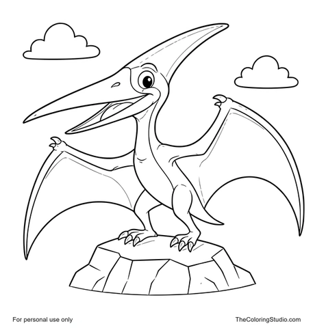
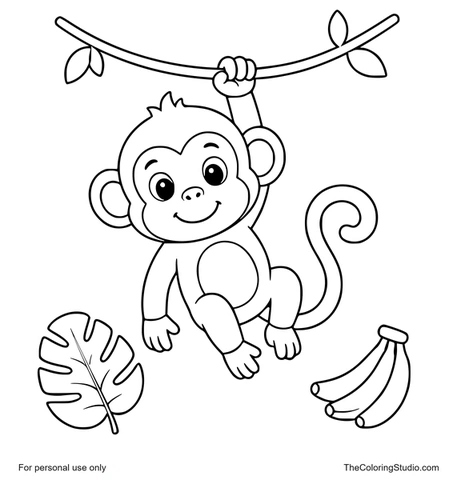
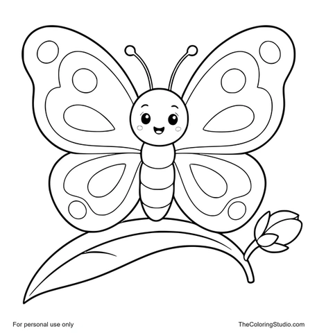
From learning to coloring
Ready to Color?
Explore free printable coloring pages for your next creative moment.
Browse All Coloring Pages